

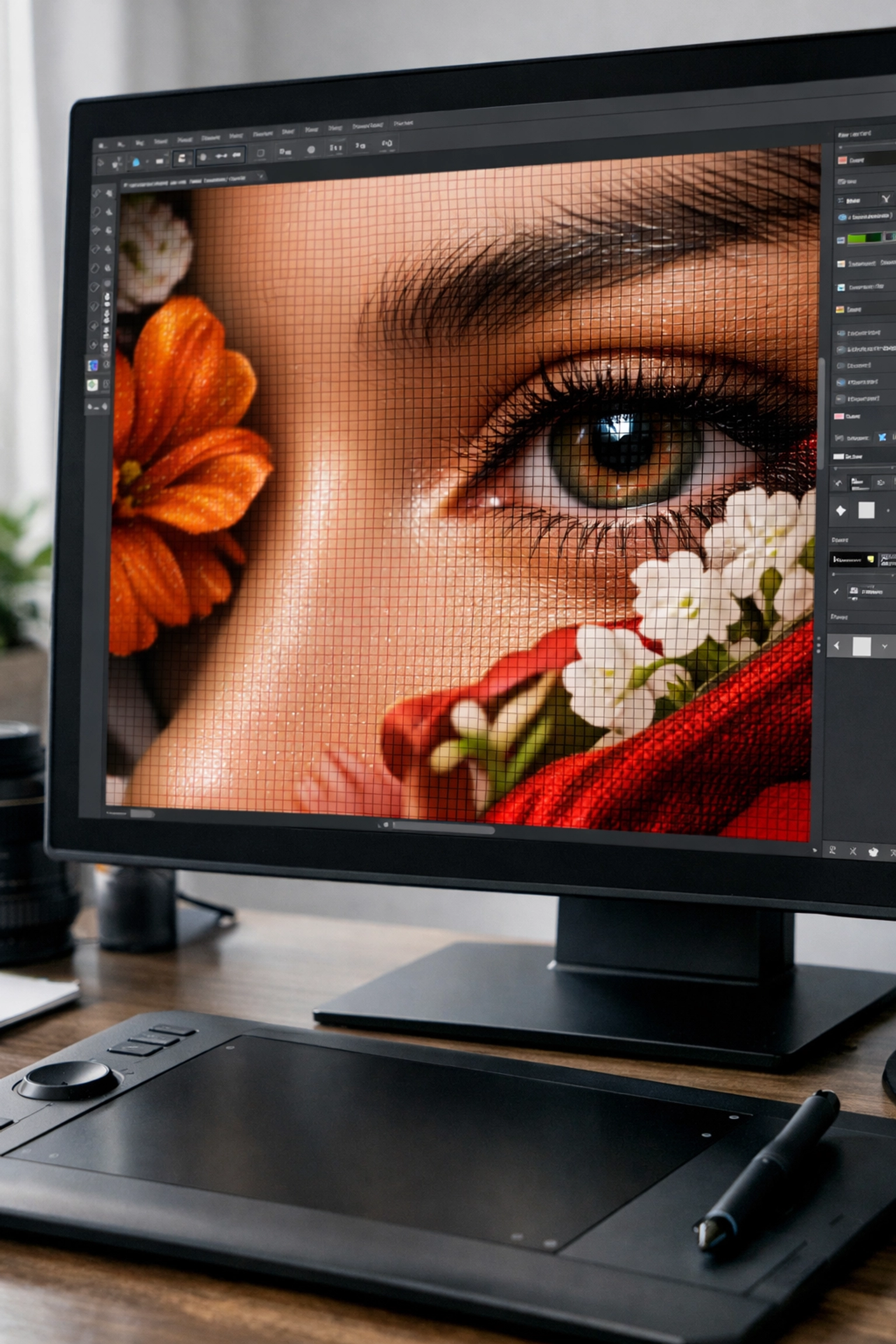
You've spent hours, maybe days, perfecting your artwork. The colours are spot-on, the composition is beautiful, and you're finally ready to see it printed as a high-quality giclee print. But then it arrives, and something's off. The colours look muddy. The edges are blurry. Details you painstakingly created have vanished.
Sound familiar?
After 25 years in the fine art printing industry, we've seen almost every file preparation mistake imaginable. The good news? Most of them are completely avoidable once you know what to look for. Let's walk through the seven most common pitfalls, and exactly how to fix them before you hit send on your next print order.
🎯 Mistake #1: Low Resolution (Ignoring the 300 DPI Rule)
Here's the thing: what looks crisp and beautiful on your screen can turn into a pixelated disaster when printed. Your monitor only needs 72-96 DPI to look sharp, but giclee printing requires much more data.
The fix: Always prepare your files at 300 DPI (dots per inch) at your final print size. Not 72 DPI scaled up. Not 150 DPI "because it looks fine." Exactly 300 DPI.
Let's break down what this means in real numbers:
| Print Size | Required Pixel Dimensions (at 300 DPI) |
|---|---|
| A4 (210mm × 297mm) | 2480 × 3508 pixels |
| A3 (297mm × 420mm) | 3508 × 4961 pixels |
| A2 (420mm × 594mm) | 4961 × 7016 pixels |
💡 Pro tip: If you're working from a scan or photograph, scan at 600 DPI and downsample to 300 DPI. This gives you flexibility to crop without losing quality. If you need a hand capturing the best possible source file, our professional scanning service can save you a lot of trial-and-error.
Working digitally from scratch? Set your canvas size to your desired print dimensions at 300 DPI before you start creating. Trying to "upres" a low-resolution file later rarely works, you can't add detail that wasn't captured in the first place.
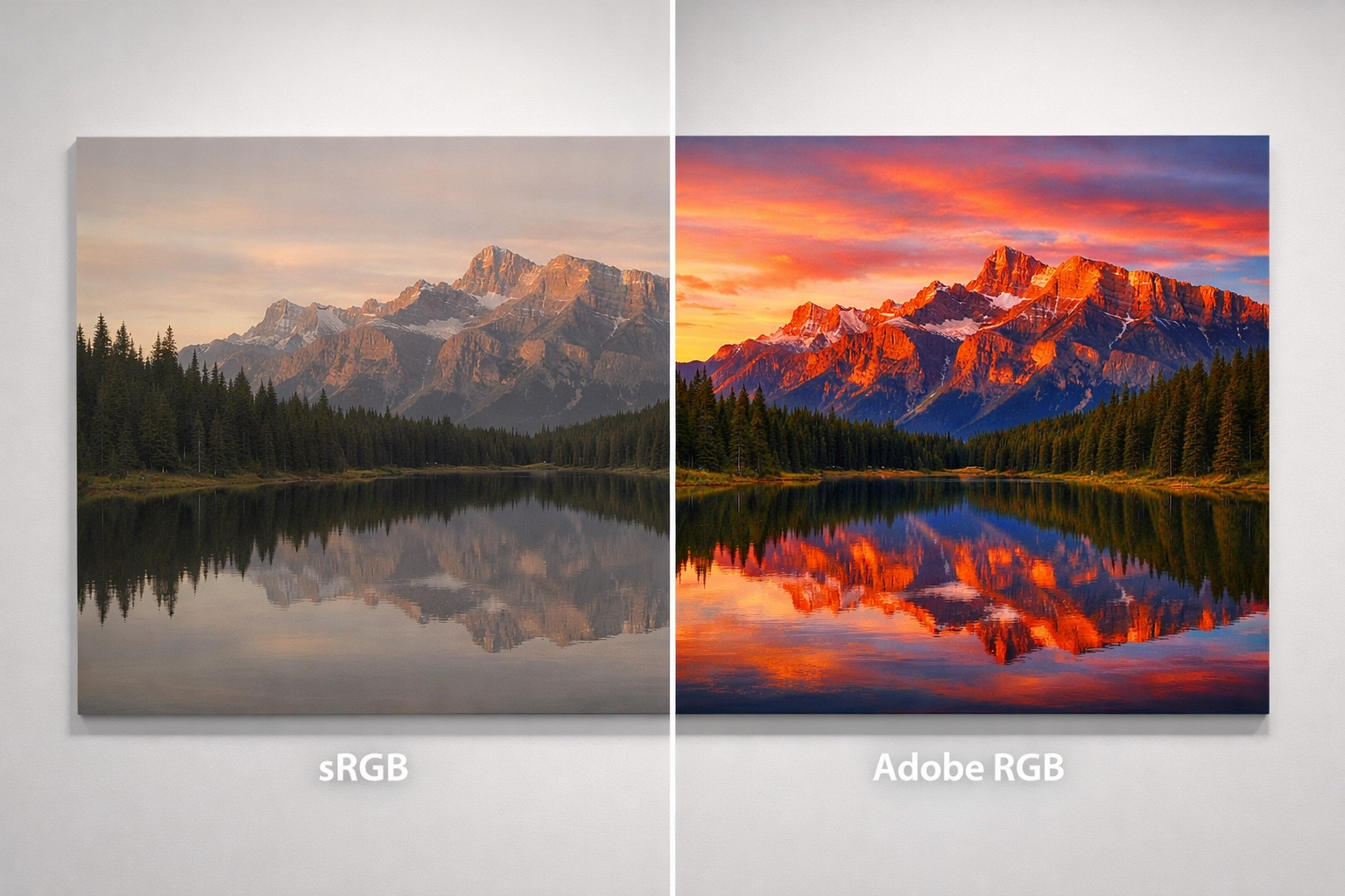
🎨 Mistake #2: Wrong Colour Profiles (The RGB vs CMYK Confusion)
This is where things get technical, but stay with me, it's genuinely important for getting accurate giclee prints.
Your screen emits light (RGB colour), but printers use ink (CMYK or extended gamut). They're fundamentally different systems, and what you see on screen won't automatically translate to paper.
The fix: For fine art printing, we actually recommend working in Adobe RGB (1998) rather than CMYK. Here's why:
Adobe RGB has a wider colour gamut than sRGB (which is designed for web use) and captures more of the rich, vibrant colours that fine art giclee printers can reproduce. Modern fine art printing uses 8-12 ink colours, not just CMYK, so Adobe RGB gives us more colour information to work with.
| Colour Profile | Best For | Gamut Size |
|---|---|---|
| sRGB | Web, social media | Smallest |
| Adobe RGB (1998) | Fine art printing, photography | Medium-Large |
| ProPhoto RGB | Professional photography (advanced) | Largest |
💡 Pro tip: Always embed your colour profile in the file. In Photoshop, go to Edit > Convert to Profile and select Adobe RGB (1998), then save with "Embed Color Profile" ticked.
If you're unsure what profile your file is using, just ask, we're always happy to advise. You can also check our FAQ about colour profiles for more detailed guidance.
📄 Mistake #3: Incorrect File Formats (JPEG When You Need TIFF)
Not all file formats are created equal, and choosing the wrong one can compromise your print quality before we even open the file. If you're unsure what to export, our guide What File Format Should I Use? breaks it down in plain English.
The fix: Use TIFF (.tif) files for final print submissions. Here's why:
JPEG uses lossy compression, meaning it discards data every time you save the file. Open it, make a tiny adjustment, save it again? You've lost more quality. Do this a few times and you'll see visible degradation, especially in subtle gradients.
TIFF files use lossless compression (or no compression at all). They're larger files, yes, but they preserve every pixel of your artwork exactly as you created it.
| Format | Best For | File Size | Quality |
|---|---|---|---|
| JPEG | Web preview, email proofs | Small | Lossy (degrades) |
| TIFF | Final print files | Large | Lossless (perfect) |
| PNG | Digital artwork with transparency | Medium | Lossless |
| PSD | Working files (layers intact) | Largest | Lossless |
For digital paintings and illustrations, we also accept high-quality PSD (Photoshop) or PNG files. Check our accepted file formats if you're working in specialist software.
📐 Mistake #4: Forgetting Bleed and Margins
This is one of the most common mistakes we see: and one of the easiest to fix.
If your artwork has colour or imagery that extends right to the edge of the paper (called "full bleed"), you need to build in extra space beyond your finished dimensions. Why? Because paper can shift microscopically during cutting. Without bleed, you risk a thin white line appearing along one edge.
The fix: Add 3-5mm bleed on all sides where your design runs to the edge.
Here's what that looks like in practice:
- Finished print size: A4 (210mm × 297mm)
- Canvas size with bleed: 216mm × 303mm (add 3mm on each side)
- Keep important elements at least 5mm inside the finished trim line (this is called the "safe area")
💡 Pro tip: If you want a white border around your print, tell us the border width when you upload. We'll add it during printing: no need to build it into your file.
Not sure how much bleed to add? Our file preparation guide has step-by-step instructions with visual examples.
🔍 Mistake #5: Not Checking for Dust, Scratches, and Scanning Artifacts
If you're working from scans of physical artwork: paintings, drawings, watercolours: this one's for you. (And if you're still deciding whether to photograph or scan in the first place, see our guide: How to Photograph or Scan Your Artwork.)
Dust particles, scanner bed scratches, and tiny imperfections get magnified when printed large. That barely-visible speck on your screen? It becomes a glaring white dot on an A2 giclee print.
The fix: Zoom in to 100% view (or higher) and methodically scan across your entire image. Look for:
- Dust spots (especially in solid colour areas or skies)
- Scanner bed scratches (usually straight lines)
- Stray marks from scanning
- Areas where colours look inconsistent
Use Photoshop's Spot Healing Brush or Clone Stamp tool to clean these up. It might take a little extra time, but it's absolutely worth it for museum-quality results.
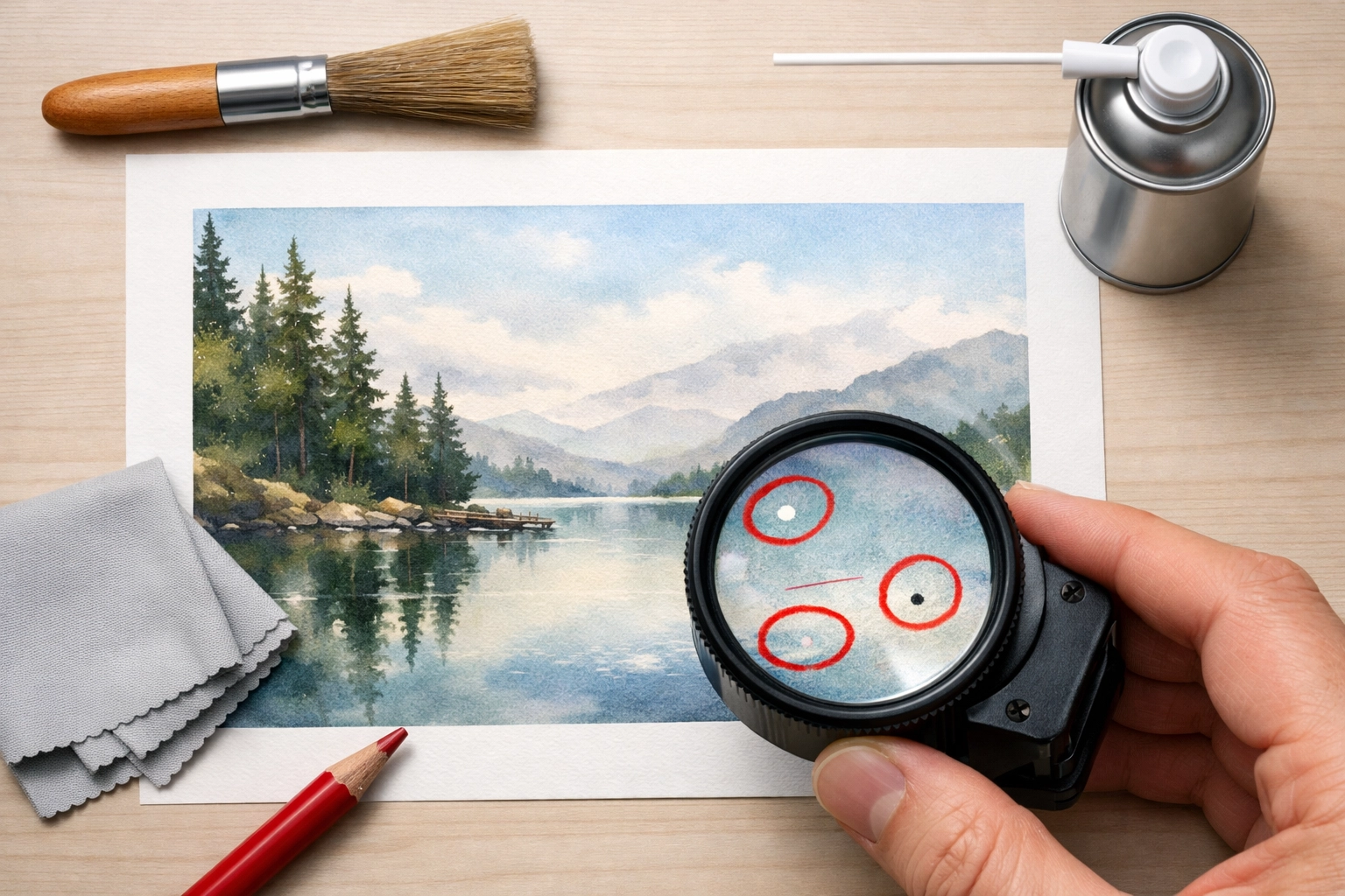
💡 Pro tip: Scan on a clean, lint-free surface and use compressed air to clean both your artwork and scanner bed before scanning.
✨ Mistake #6: Over-Sharpening Your Image
Sharpening can enhance detail: or it can create ugly halos and artifacts that scream "amateur edit." We see this particularly with photographs that have been over-processed.
The fix: Sharpen subtly and strategically:
- Always work on a duplicate layer (never sharpen your original)
- Use Unsharp Mask or Smart Sharpen in Photoshop: not basic "Sharpen" filters
- Zoom to 100% and adjust until details look crisp but natural
- Apply sharpening as the last step before saving your final TIFF
Different artwork needs different approaches:
- Photographs: Moderate sharpening on edges
- Paintings (scanned): Minimal or no sharpening: texture is already there
- Digital illustrations: Light sharpening only if needed
When in doubt, under-sharpen. We can always add a touch during printing if needed, but we can't remove excessive sharpening.
🖥️ Mistake #7: Not Calibrating Your Monitor
You've nailed the colour profile, chosen the right paper, and your file is perfect: but your prints still don't match your screen. The culprit? Your uncalibrated monitor is lying to you.
The fix: Invest in a monitor calibration device (like an X-Rite ColorMunki or Datacolor SpyderX). These tools adjust your monitor's colour accuracy so what you see actually matches what prints.
Here's what uncalibrated monitors get wrong:
- Brightness: Too bright, making prints look darker than expected
- Colour temperature: Too warm or cool, shifting all your colours
- Contrast: Inaccurate blacks and whites
If buying a calibrator isn't an option right now, at least:
- Set your monitor brightness to around 120 cd/m² (not maximum)
- Use a neutral grey desktop background when editing
- View your artwork in a well-lit room (not direct sunlight)
- Request a proof print before committing to large editions
💡 Pro tip: Calibrate monthly if you're printing regularly. Monitor colours drift over time.
✅ Your Pre-Print Checklist
Before you submit your files for fine art printing, run through this quick checklist:
- File is 300 DPI at final print size
- Colour profile is Adobe RGB (1998) and embedded
- File format is TIFF (or high-quality PSD/PNG)
- Bleed added (if printing to edge)
- Image checked at 100% zoom for dust/artifacts
- Sharpening applied subtly (if needed)
- Monitor calibrated (or proof requested)
We're Here to Help
At Giclée UK, we've been producing museum-quality giclee prints for 25 years. We know file preparation can feel overwhelming, especially if you're new to professional printing. That's exactly why we check every file before printing: and we'll always contact you if we spot potential issues.
Got questions about preparing your files? Not sure which colour profile to use or how to add bleed? Just get in touch. We're always happy to walk you through the process: because the better your files, the more stunning your prints.
Your artwork deserves to be printed beautifully. Let's make sure it is.
✅ Ready to Print?
When you're ready, head over to our Giclée Printing service page to choose your paper, size, and finish—and upload your file with confidence:
https://gicleeuk.com/giclee-printing/