You've nailed your image file, resolution's perfect, colours are spot-on, and now you're faced with the million-dollar question: which paper should I print on?
If you're staring at terms like "baryta," "cotton rag," and "textured finish" wondering what on earth they all mean, you're not alone. Paper choice can make or break a fine art print, but it doesn't have to be confusing.
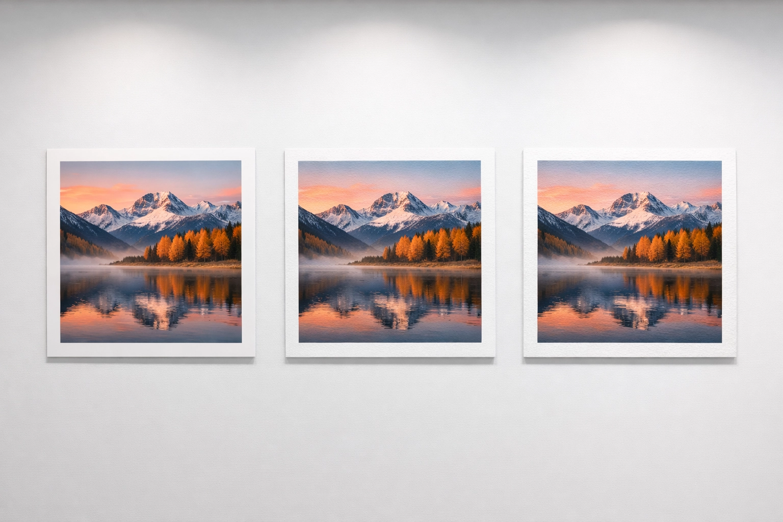
Let's break down the three main paper types we use for giclée prints and help you figure out which one will make your artwork sing.
🎨 Why Paper Choice Actually Matters
Here's the thing: the same image printed on different papers can look like completely different artworks. Paper affects everything, colour saturation, contrast, texture, longevity, and even how people feel when they look at your print.
A photograph on glossy baryta paper pops with deep blacks and vibrant colours. The same photo on textured watercolour paper? Softer, more painterly, less punchy. Neither is "better", they're just different tools for different artistic goals.
Your paper choice should complement your art style, your subject matter, and how you want viewers to experience your work.
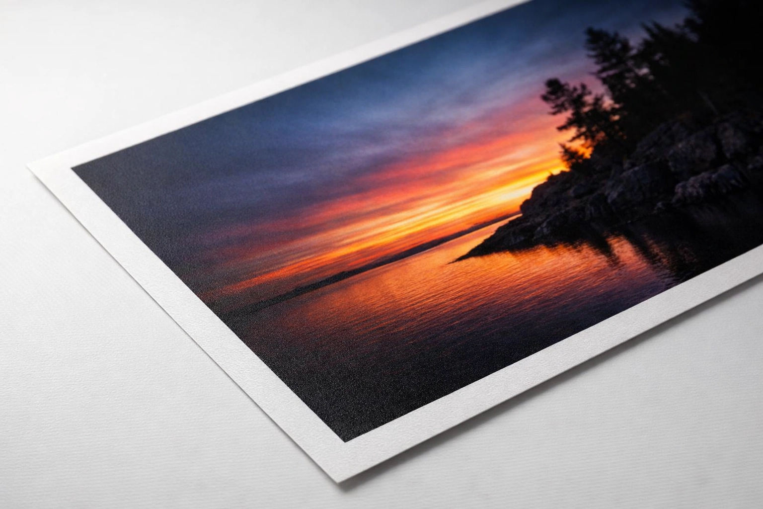
📄 What is Baryta Paper?
Baryta paper is the heavyweight champion for photographers and anyone after maximum colour impact.
Originally used in traditional darkroom printing, baryta paper has a coating of barium sulfate on its surface. This creates an ultra-smooth base that allows inks to sit beautifully on top, delivering:
- Deeper, richer blacks (what we call a high Dmax)
- More vibrant colour saturation
- Exceptional shadow detail with smooth tonal transitions
- Wider colour gamut than standard cotton rag papers
At Giclée UK, we use museum-quality baryta papers like Hahnemühle Photo Rag Baryta and Canson Baryta Photographique, both are 100% cotton, acid-free, and built to last centuries without fading.
Matte Baryta: Best of Both Worlds
Here's where it gets interesting: baryta papers come in both glossy and matte finishes.
Matte baryta papers (like Hahnemühle Photo Rag Matt Baryta) give you all the colour richness and deep blacks of traditional baryta without the glossy reflections. You get a completely flat, non-reflective surface with a velvety feel that's perfect for gallery exhibitions where lighting can be unpredictable.
💡 Pro tip: Matte baryta is our go-to recommendation for photography prints heading to galleries or art fairs, it looks stunning from any angle without glare.
🖼️ What is Matte Paper?
When we talk about matte paper in fine art printing, we're usually referring to smooth, non-reflective cotton rag papers without the baryta coating.
Classic matte papers like Hahnemühle German Etching or Fine Art Pearl have:
- A soft, natural white tone (rather than bright white)
- Zero gloss or sheen, completely glare-free
- A slightly textured surface (though much smoother than "textured" papers)
- Excellent archival qualities (300+ year lightfastness ratings)
Matte papers have a more traditional "fine art" feel, they're what you'd expect when you think of museum-quality prints. They're versatile enough for both photography and reproductions of paintings, though they won't achieve the same colour intensity as baryta papers.
Best for: Fine art photography, mixed media, digital paintings, and any work where you want a softer, more subtle presentation.
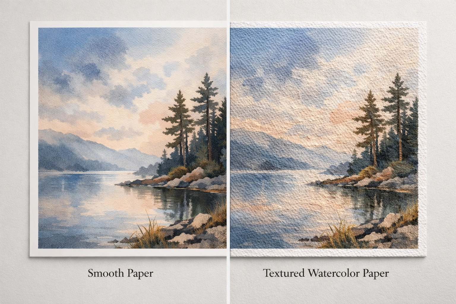
🎭 What is Textured Paper?
Textured fine art papers have visible, tactile surface patterns that add dimension and character to your prints.
These papers are designed to mimic traditional art papers, think watercolour paper with its distinctive tooth, or handmade papers with natural deckled edges. Popular options include Hahnemühle Torchon (rough watercolour texture) and William Turner (subtle mould-made texture).
What makes textured papers special:
- Visible surface pattern you can see and feel
- Diffuses light naturally, eliminating glare
- Adds authenticity to reproductions of traditional media
- Softens fine detail, which can be a feature or a drawback depending on your art
The texture physically breaks up the image slightly, creating a more painterly look. For reproducing watercolours, acrylics, or pastels, this is brilliant, it makes the print feel like an original artwork. For sharp, detailed photography? Not so much.
💡 Pro tip: Textured papers are much easier to sign with a pen or pencil than smooth baryta papers. If you're planning to hand-sign your limited editions, texture is your friend.
📊 Paper Comparison: At a Glance
| Feature | Baryta Matte | Standard Matte (Cotton Rag) | Textured Paper |
|---|---|---|---|
| Surface finish | Ultra-smooth, flat, no gloss | Smooth with slight texture | Visible, tactile texture |
| Colour saturation | Very high | Good | Moderate |
| Black depth (Dmax) | Deepest blacks | Good blacks | Moderate |
| Colour gamut | Widest available | Standard | More limited |
| Detail sharpness | Excellent | Very good | Softened by texture |
| Best for | Photography, digital art | Versatile fine art | Traditional media reproductions |
| Glare/reflections | None | None | None |
| Easy to sign? | Difficult (very smooth) | Moderate | Easy |
| Gallery-ready feel | Professional | Traditional | Handcrafted |
🎯 Which Paper Should You Choose?
Let's make this practical. Here's how to match paper to your artwork:
Choose Baryta Matte if:
✅ You're printing photography (landscapes, portraits, street photography)
✅ You want maximum colour impact and contrast
✅ Your work has important shadow detail you don't want to lose
✅ You're printing for gallery exhibitions or competitions
✅ You want a modern, professional presentation
Real-world example: A dramatic landscape photograph with moody skies and rich foreground detail will absolutely sing on baryta matte. The deep blacks in the shadows and saturated colours in the sky will have more impact than on any other paper.
Choose Standard Matte (Cotton Rag) if:
✅ You're printing digital paintings or mixed media work
✅ You want a softer, more traditional fine art feel
✅ You value versatility, it works for most art styles
✅ You prefer a natural white rather than bright white base
✅ You're after that classic "museum print" aesthetic
Real-world example: Digital illustrations, abstract art, or fine art photography that doesn't rely on super-deep blacks all look beautiful on cotton rag papers. They're the Swiss Army knife of fine art printing.
Choose Textured Paper if:
✅ You're reproducing watercolours, acrylics, oils, or pastels
✅ You want prints that feel like original artworks
✅ The tactile experience matters to you and your buyers
✅ You plan to hand-sign your prints with pen
✅ You want to disguise the fact it's a print (in a good way!)
Real-world example: A watercolour painting printed on Hahnemühle Torchon (rough texture) looks and feels remarkably like the original. The texture adds authenticity that smooth papers simply can't match.
🤔 Still Not Sure? We Can Help
Here's what we recommend: order sample packs.
We offer small test prints on different papers so you can see and feel the difference with your own artwork. What looks amazing on screen might surprise you in person, sometimes a paper you didn't think would work becomes your absolute favourite.
Can't decide between two options? Print the same image on both and compare them side-by-side. The right choice usually becomes obvious pretty quickly.
And if you're still torn, get in touch, we're always happy to chat through your specific project and make recommendations based on your art style and goals.
🔗 Common Paper Mistakes to Avoid
While we're talking about paper choice, watch out for these common pitfalls:
Choosing based on price alone, yes, textured papers are often cheaper, but they're not the right choice for everything. Using the wrong paper can make a £500 fine art photograph look like a £20 poster.
Ignoring your file preparation: even the best paper won't save a low-resolution file or one with the wrong colour profile. Check out our guide on preparing your files for giclée printing to avoid disappointment.
Not considering your audience: photographers buying fine art prints expect baryta or high-quality smooth papers. Traditional art collectors might prefer textured papers that feel more "authentic."
✅ Quick Decision Checklist
Use this to narrow down your choice:
- Is your work photography or digital art? → Start with baryta matte or smooth cotton rag
- Are you reproducing traditional paintings? → Consider textured papers
- Do you need maximum colour impact? → Baryta matte wins
- Do you want a softer, more subtle feel? → Standard matte cotton rag
- Will you hand-sign the prints? → Textured papers are easiest
- Is it heading to a gallery with unpredictable lighting? → Matte finishes (any type) eliminate glare
- Does it have lots of fine detail? → Smooth papers preserve sharpness better
The truth is, there's no single "best" paper: only the best paper for your specific artwork. That's what makes fine art printing in the UK so exciting: you have complete creative control over how your work is presented.
Want to see the difference for yourself? Drop us a line about sample prints, or if you're ready to go, we've got you covered with museum-quality giclée printing on all the papers we've discussed today.
Your art deserves the perfect paper( let's find it together.)